



PW Vidyapeeth had the trust of students and parents, but the brand wasn't speaking to that strength. Visually scattered, tonally inconsistent, and lacking a unifying idea, the identity felt like it had grown in pieces rather than been designed as a whole.
The brief was clear: bring cohesion, bring confidence, and make the brand feel worthy of the trust students and parents were already placing in it.


We set out to build a scalable design language, one that could flex across outdoor media, digital, merchandise, and uniforms without losing its character. Alongside the visuals, we crafted a line the brand could own, positioning Vidyapeeth as more than a promise, a statement, and the steady force behind a student's preparation.
Now the brand's core online and offline tagline
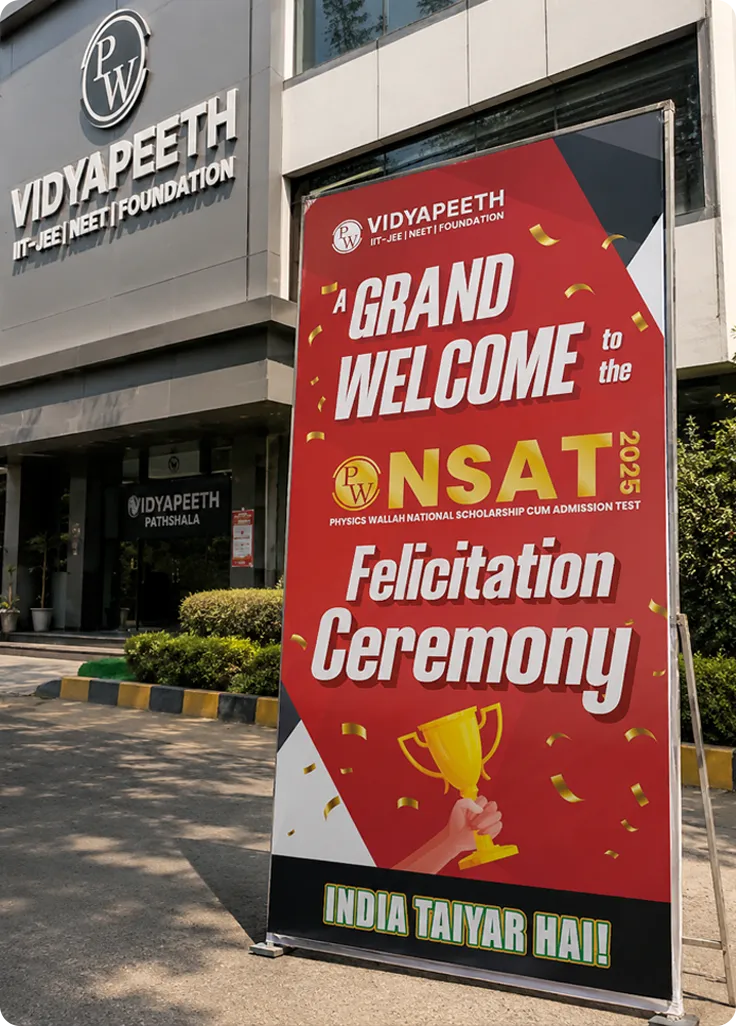

We rebuilt the visual language from the ground up, establishing a refreshed colour palette, typography system, and graphic vocabulary that felt contemporary, confident, and rooted in the brand's core purpose: preparing students to succeed.
High-impact hoardings and signage redesigned for instant recognition.
10+ physical centres refreshed with a unified environment design
Bags, uniforms, and stationery were brought into the new identity
150+ assets across social, digital ads, and platform communications
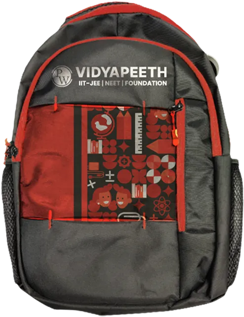
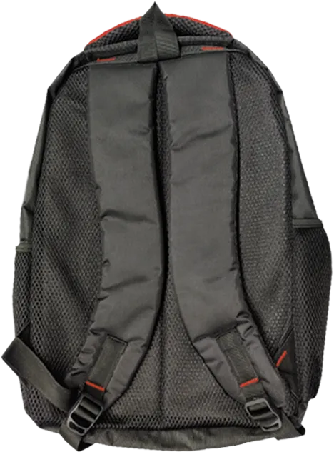
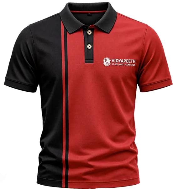
Most education brands design for parents while speaking to the students. We made a deliberate choice to design for both, with the visual language signalling reliability and quality to parents, and aspirational and motivating to a student staring at their study materials.
That shift in framing from institution-led to student-centred was the creative core of everything we built.
The scalable system approach came from a simple truth: Consistency, done well, is its own form of confidence and trust builder.


The iterative system approval came from a single truth:
Follow us on